

By creating 3 self portrait posters, I experimented with monotone, duotone, and tritone color schemes. The aspects of myself that I chose to include are "Fun-loving", "Bright", and "Cheery". Since I love the 1960s, I wanted my posters to match the playful spirit of that decade; the colors, words, and positions of my photos were meant to convey this feeling. This project taught me how to combine many elements into one balanced composition, which was a challenge. I also learned how to colorize images in a new way, which will definitely be beneficial for my future career!


This is my monotone poster. I loved the idea of using type as a frame of sorts for the images and objects. It was a challenge to balance all the elements within the word "Fun-loving", but I managed to make it work!
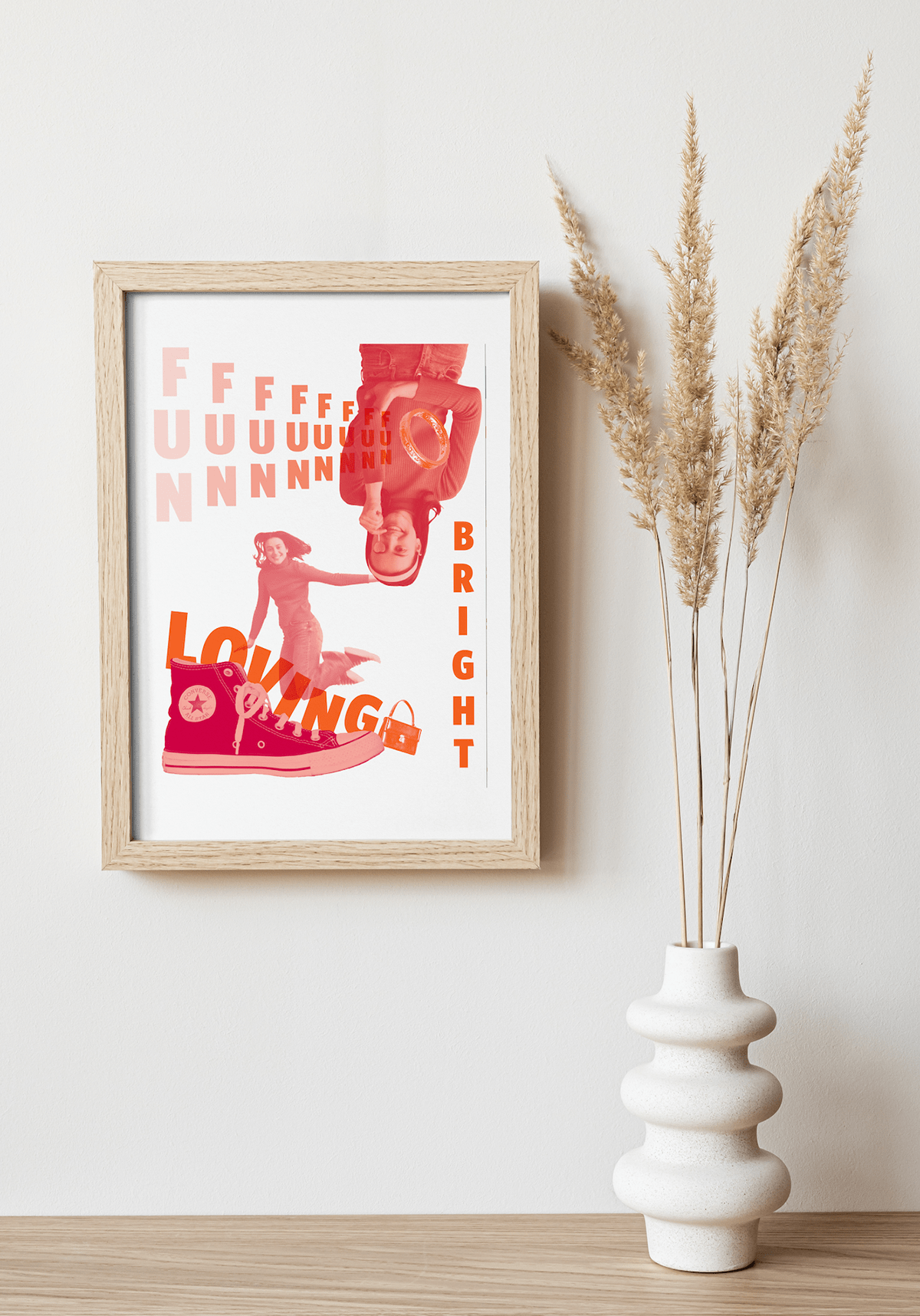
This poster has a duotone color scheme. I wanted to have the shoe ground the image, give it a foundation. I thought that by flipping the second portrait upside down, it could create some interest and balance. The repeated "FUN" aspect creates some flow and continuance.

This poster uses a tritone color scheme. I was definitely inspired by The Brady Bunch. My intention was to make this look like an advertisement you would see for a show or product in the 1960s. By using multiple of each object and word, I was able to create some movement in the composition.

Thank you!


